Plotting trees#
Pycea implements an intuitive tree plotting language where complex plots can be built from simple components:
pycea.pl.branches()plots the branches of a treepycea.pl.nodes()plots the nodes of a treepycea.pl.annotation()plots leaf annotations associated with a tree
In this tutorial, we will use C. elegans data from Packer, et al. 2019 to demonstrate the features of these functions and how they can be combined. This dataset contains the C. elegans lineage tree up to 400 minutes post fertilization, roughly corresponding to the Coma stage, as well as transcriptomic data from scRNA-seq aligned to the tree and spatial coordinates from live cell imaging.
import pycea as py
import scanpy as sc
import matplotlib.pyplot as plt

plt.rcParams["figure.figsize"] = (5, 5)
The C. elegans data can be easily loaded using pycea.datasets.packer19(). For this tutorial, we will subset the tree to only include lineages where transcriptomic data is available.
tdata = py.datasets.packer19(tree="observed")
tdata
TreeData object with n_obs × n_vars = 988 × 20222
    obs: 'birth_time', 'dies', 'annotation_name', 'clade', 'generation_within_clade', 'parent_cell', 'lineage_group', 'umap_cluster', 'cells_produced', 'x', 'y', 'z', 'time', 'tree'
    var: 'gene_id'
    obsm: 'spatial'
    obst: 'tree'
Plotting branches#
The first step is rendering the branches of the tree using pycea.pl.branches(). The depth_key parameter specifies the node attribute where the depth is stored. Here we with use depth = 'time' which contains precise division times from live cell imaging.
py.pl.branches(tdata, depth_key="time");
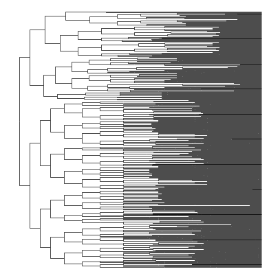
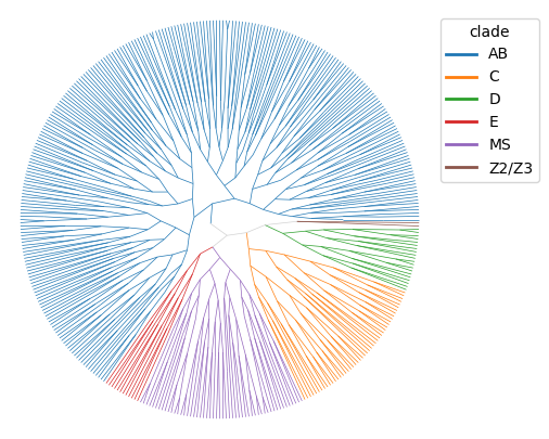
The way branches are plotted is highly customizable. For example, we can specify angled_branches with polar coordinates and then color the branches by clade.
py.pl.branches(tdata, depth_key="time", angled_branches=True, polar=True, color="clade");
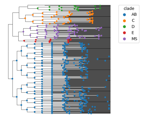
Plotting nodes#
Once branches are plotted, we can render the nodes of the tree using pycea.pl.nodes(). Similar to the branches, we can use the color parameter to specify how the nodes should be colored. The slot parameter specifies which field of the tdata object contains the color information.
py.pl.branches(tdata, depth_key="time")
py.pl.nodes(tdata, color="clade", slot="obst");
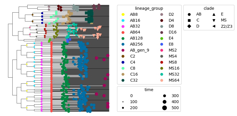
The style and size of nodes can also be specified. For example, we can use style to indicate the clade, size to indicate the time, and color to indicate the lineage_group annotation. Conveniently, the legends are automatically placed and can be customized using the legend_kwargs parameter.
py.pl.branches(tdata, depth_key="time")
py.pl.nodes(tdata, color="lineage_group", size="time", style="clade", legend=True, legend_kwargs={"ncols": 2});
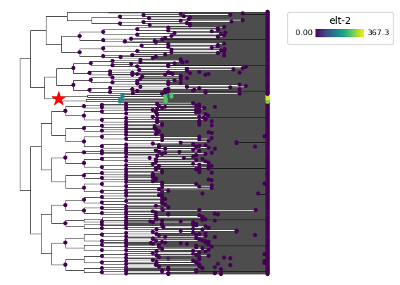
Since internal nodes are observed in the C. elegans dataset, we can also color nodes by the expression of genes such as elt-2, which is a transcription factor expressed in the E (Endoderm) lineage. We’ll set nodes = 'all' to plot both the leaf and internal nodes.
pycea.pl.nodes() can be called multiple times to plot different sets of nodes. For example, we can mark the E progenitor cell wth a red star.
py.pl.branches(tdata, depth_key="time")
py.pl.nodes(tdata, color="elt-2", nodes="all")
py.pl.nodes(tdata, color="red", nodes="E", style="*", size=200);
Plotting annotations#
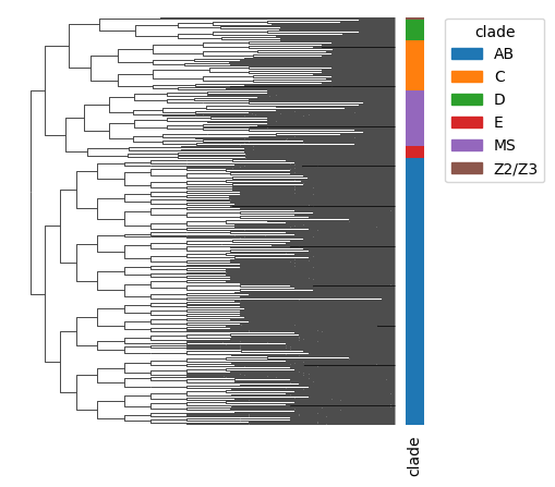
We can also add leaf annotations to the plot using pycea.pl.annotation(). Again we will plot the clades but this time a leaf annotation.
py.pl.branches(tdata, depth_key="time")
py.pl.annotation(tdata, keys="clade");
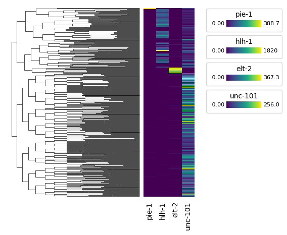
Annotation keys can be any observation attribute in the tdata object and multiple keys can be specified. For example, we can plot the expression of pie-1, hlh-1, elt-2, and unc-101 in the leaves of the tree.
We’ll set width = .1 to make the annotations wider. The width parameter specifies the width the annotation relative to the width of the tree.
py.pl.branches(tdata, depth_key="time")
py.pl.annotation(tdata, keys=["pie-1", "hlh-1", "elt-2", "unc-101"], width=0.1);
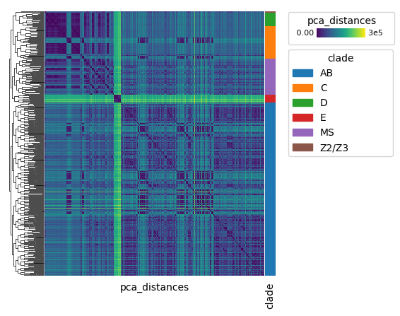
Matrices stored in obsm and obsp can also be plotted as annotations. To see how lineage distance relates to transcriptomic distance, we can plot the transcriptomic distance between pairs of cells (PCA space). Clearly, the E clade is transcriptionally distinct from the other clades.
sc.pp.pca(tdata, n_comps=10, key_added="pca")
py.tl.distance(tdata, key="pca")
py.pl.branches(tdata, depth_key="time")
py.pl.annotation(tdata, keys=["pca_distances"], legend=True)
py.pl.annotation(tdata, keys=["clade"], legend=True, width=0.3);
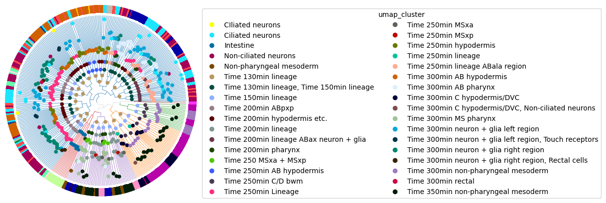
Putting it all together#
Of course, all three of these functions can be layered together. Here we’ll plot branches colored by clade and then annotate nodes and leaves with the umap_cluster label.
py.pl.branches(tdata, depth_key="time", polar=True, color="clade", legend=False, legend_kwargs={"ncols": 2})
py.pl.nodes(tdata, color="umap_cluster", size=20, legend=True, legend_kwargs={"ncols": 2})
py.pl.annotation(tdata, keys=["umap_cluster"], width=0.1, legend=False);
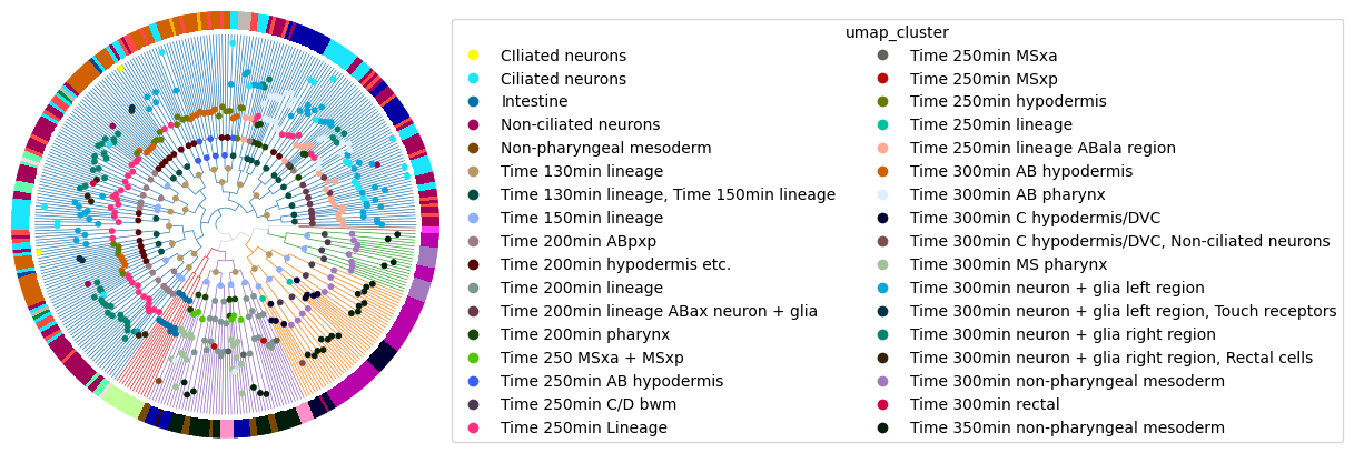
For convenience, Pycea also implements pycea.pl.tree() which combines these functions. pycea.pl.tree() is useful for quickly visualizing a tree, but does not provide the same flexibility as plotting components individually.
py.pl.tree(
    tdata,
    depth_key="time",
    polar=True,
    branch_color="clade",
    node_color="umap_cluster",
    keys="umap_cluster",
    annotation_width=0.1,
    legend={"node":True,"branch":False},
    legend_kwargs={"ncols": 2},
);
Learning more#
Checkout Customizing Scanpy plots for more information on customizing plots. Scanpy and Pycea both use the Matplotlib plotting library so plots can be customized in a similar way.
If you have any questions or feedback, please reach out by submitting an issue on GitHub.